
The annual Sherwin-Williams Colormix® Forecast is not just a useful resource for your residential projects. As the company’s team of experts craft their color forecast, they hand-select key commercial colors and weave them into each palette. The result is Colormix® for Commercial Spaces.
From stunning blues and greens to dramatic darks and deeps, you can recommend these colors for your customers’ commercial properties with confidence. In this article, we’ll take a look at these curated picks as they apply to commercial, hospitality, education, healthcare, multi-family, new residential and beyond.
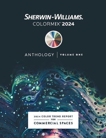
There are four numbered color palettes in this year’s Anthology: Volume One color trend report, each representing a major emphasis in the color world.
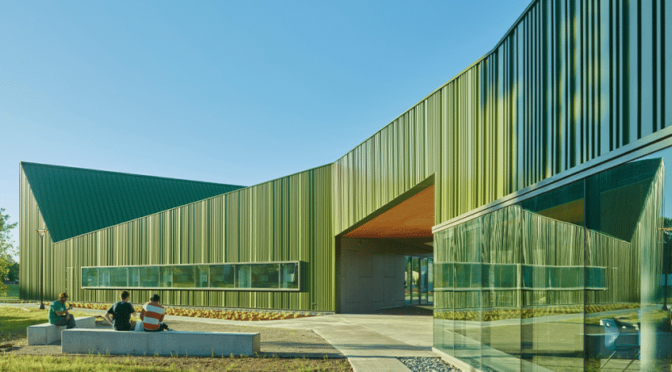
Palette No. 1: Blues and Greens
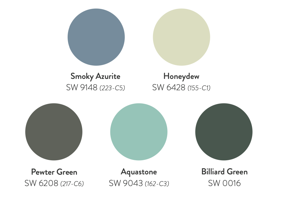
These key colors introduce calming qualities in spaces where focus, relaxation and rejuvenation are needed. Incorporating blues and greens can harness the psychological and physiological benefits associated with these colors.
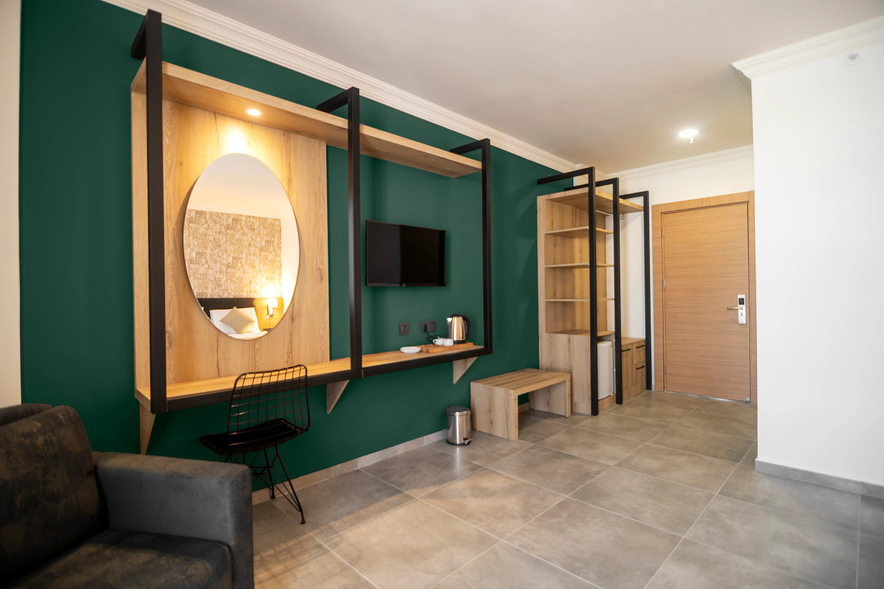
Hospitality color example from Blues and Greens palette: Billiard Green SW 0016
Palette No. 2: Reds and Purples
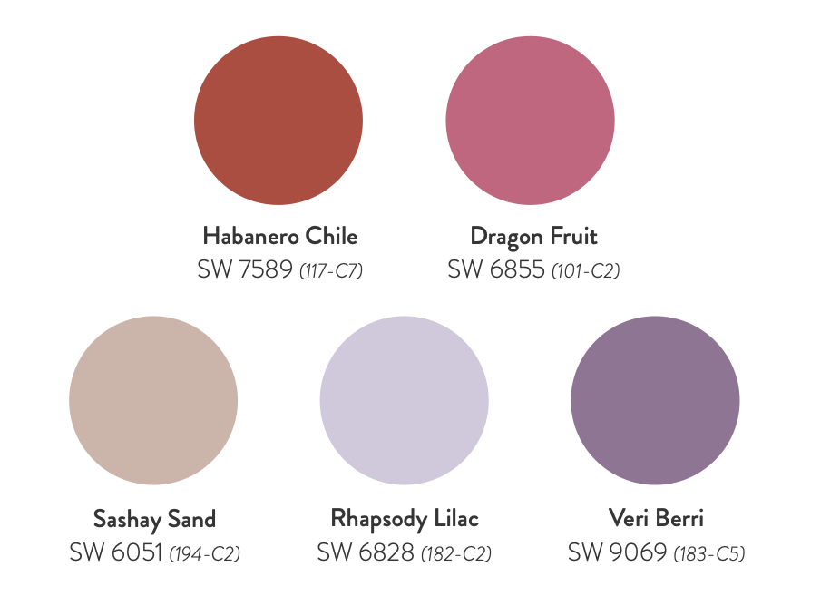
A life-giving energy follows the ever-alluring hues of red and purple. Whether deep or mid-toned, this color grouping revolves around the emerging warmth in our spaces. Stimulating reds can be strategically used in areas where heightened attention is desired, while inspiring purples foster a sense of introspection fit for reflective spaces.
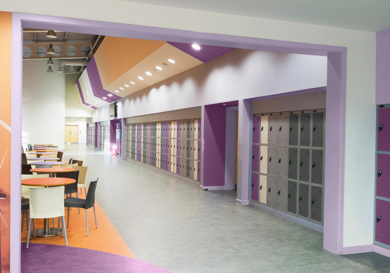
School color example from Reds and Purples palette: Veri Berri SW 9069 (183-C5) and Rhapsody Lilac SW 6828 (182-C2), paired with Soft Apricot SW 635 (126-C2)
Palette No. 3: Deeps and Darks
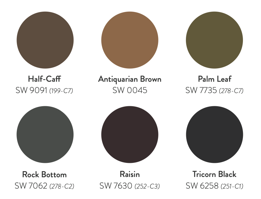
These dark hues shake up the traditional concept of sanctuary, evoking feelings of intimacy, comfort and coziness. In an era where well-being grows more important, these key colors can craft environments that provide a sense of refuge with a sophisticated and contemporary aesthetic.

Office/workplace color example from Deeps and Darks palette: Half-Caff SW 9091 (199-C7)
Palette No. 4: Delicate Tints
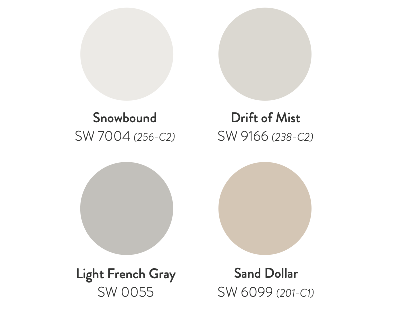
Stabilizing whites and delicate tints bring a soft stillness to this palette. These leading shades of white, gray and beige remain foundational for spaces that promote healing and harmony by amplifying brightness and creating airy atmospheres.
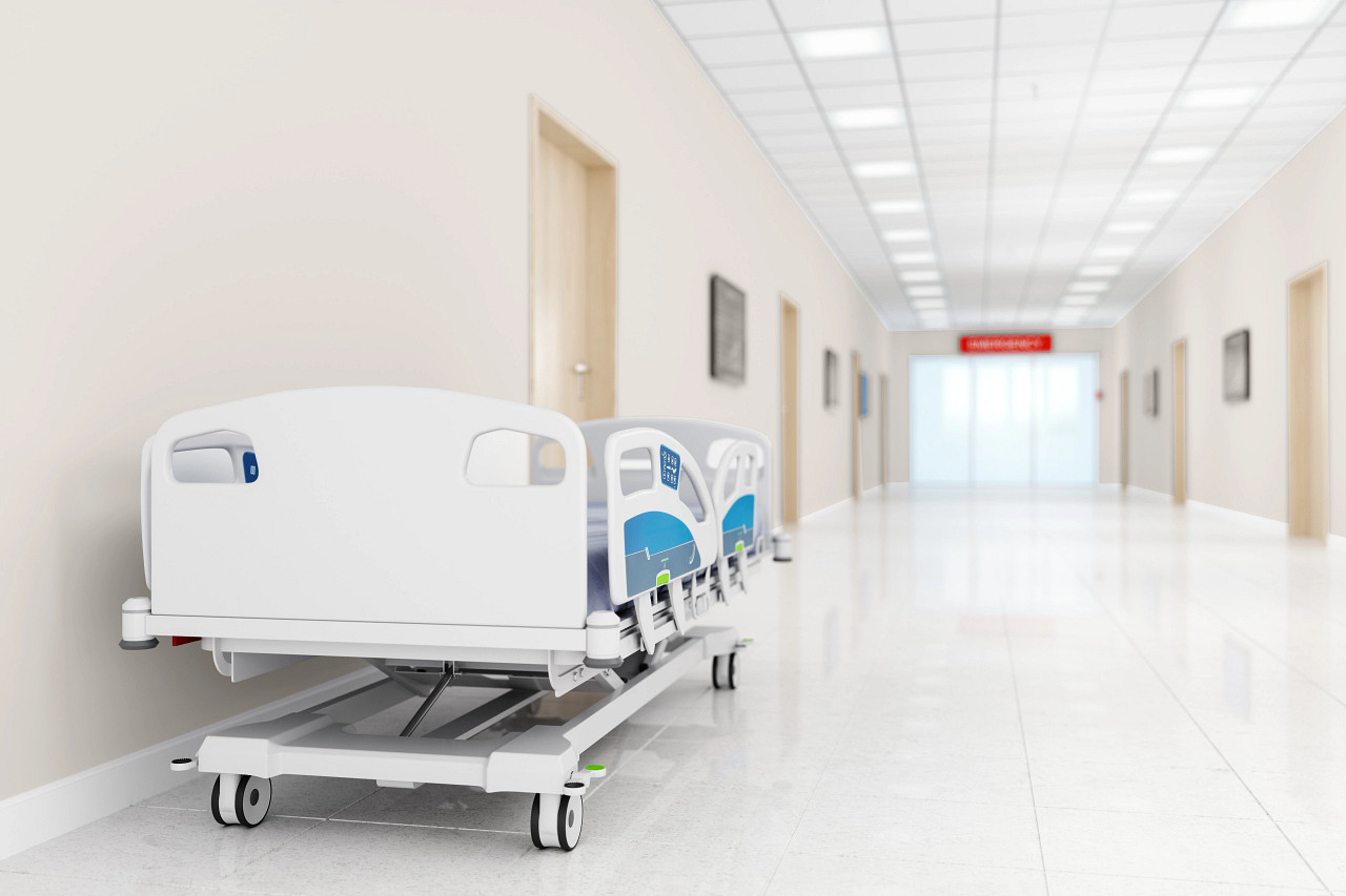
Hospital color example from Delicate Tints palette: Drift of Mist SW 9091 (199-C7)
Take a deeper dive
 Want to learn more about how each of these color collections can be put to use on your customer’s job? Download the Colormix® for Commercial Spaces Lookbook PDF from the Sherwin-Williams website.
The Lookbook contains a wealth of detailed, expert advice for every commercial painting project including:
- Corporate offices and workplaces
- Hotels, restaurants and other hospitality spaces
- Healthcare facilities
- Schools and other education buildings
- Multi-family homes
- New residential construction
Additional resources
For more color ideas and inspiration, check out these PPC stories:
- The 2024 Color of the Year: A Breezy Blue with a Hint of a Silver Lining
- Cutting Through the Noise: New Color Trend Report Gives Contractors Confidence for Color Conversations (an interview with Sue Wadden, Sherwin-Williams Director of Color Marketing)
- Introducing Virtual Color Consultation
- Four Simple Strategies for Choosing Extraordinary Exterior Colors
- Easily Navigate the Color Conversation with Homeowners
This article was originally published in the Winter 2023 issue of PPC. ©2023 Randall Reilly. Read more stories about helping your customers in the paint color selection process in the PPC magazine archive.