
As a paint pro, you probably feel qualified to answer almost any question a client asks you about the painting process. After all, it’s your area of expertise. But when conversations turn to color selection, you may feel less confident recommending colors, selecting palettes, and offering your opinion on aesthetic decisions.
Thankfully, you don’t have to be a color expert – not when you’ve got a team of color experts already on your side. The 2024 Colormix® color trend report – Anthology: Volume One – highlights cutting-edge market trends with 48 hues from four color families, giving you the tools to confidently help customers pick a color they’ll love for years to come.
Reading the forecast
Every year, the Colormix Forecast is created by a dedicated team of color experts.

“Our Global Forecast team is truly global, with team members from Asia, Europe, Latin America, the U.S. and Canada,” says Sue Wadden, Director of Color Marketing at Sherwin-Williams. “We get together once a year to present all our research: what we’re seeing in the industry, at design shows, in the coatings markets. We have this very fun, dynamic workshop where we hash out ideas, talk through trends, and throw colors on the table. And at the end, we come together with a unified picture of where we see the industry going next.”
Longtime PPC readers may note that this year’s Colormix Forecast – presented as color trend storytelling – differs from previous years. This year’s method focuses on using color palettes to convey a specific message, which reflects societal shifts, cultural values and emerging design philosophies. By tapping into the zeitgeist of our time, Wadden says, Anthology: Volume 1 is able to fuse an understanding of human psychology with design aesthetics and the cultural moment.
Wadden says this was an intentional format shift from previous years. Her team wanted to offer a direct approach to the findings that pierces through the stories to get to the real insight into color.
“Our forecasting before Anthology: Volume 1 was really about storytelling and palette development,” she says. “But the message had started getting diluted, so we wanted to adjust how we deliver information to be more relevant to what our customers were asking for. I wanted to find a way to cut through that noise and return the central focus to color–and that’s what Anthology is. It’s a color trend report that will run every other year, and it explains where the color world has been and where it’s moving.”
Though color forecasting may seem like something that would only matter to designers, it’s actually very relevant to painters. A well-used forecast can make a big difference when it comes to long-term homeowner satisfaction.
“The colors highlighted in Anthology: Volume One are the colors that are going to be in the marketplace,” Wadden says. “They’re the color options homeowners will get when they go into a big-box store to shop for a pillow. If you recommend the Anthology: Volume One colors to a customer, then the colors that are on their walls will be the same colors as the products and materials they’re buying at the store.”
The four palettes
Anthology: Volume One was put together by a global team of designers and color experts who meet once a year to share their research and discuss color trends. As a result, you can trust that all the colors in the 2024 report come backed by experts.
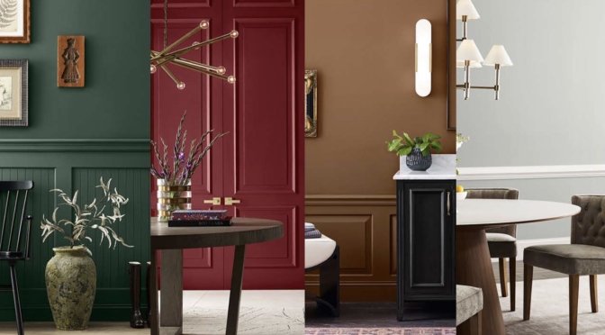
Wadden explains that there are four numbered color palettes in this year’s report, each representing a major emphasis in the color world.
- Palette 1 highlights blues and greens: “Coming out of COVID, blues and greens have been important as the colors of nature. While green has represented the first five years of this decade through 2025, we expect to see blues on the rise.”
- Palette 2 highlights warmer tones, including reds, purples, beiges, and even pink: “The Barbie effect has been a real pop-culture phenomenon, and it’s impacting homeowners’ color choices. We’re starting to see people paint bright red and pink walls, and we haven’t seen that in a long time — especially in the United States, where homeowners mostly rely on neutrals. The energy around warmer colors is exciting.”
- Palette 3 highlights deep tones: “In times of uncertainty, we look inward. Over the last few years, dark colors emerged as a stabilizing factor, and we see that trend continuing in a big way into 2024 and 2025.”
- Palette 4 highlights delicate lights and whites: “There’s a renewed interest in light tones and whites, perhaps because they represent a bit of sanctuary and respite from all the noise. They’re airy, light, and easy to live with. We expect homeowner interest in these shades to continue throughout this year and into next year.”
Start the conversation
Anthology: Volume One can help give you the confidence to guide the client to choose a color they’ll love. Using the color trend report is simple. It can be as easy as asking the homeowner what direction they’re leaning in or what atmosphere they’re trying to cultivate, and then pointing them to a matching palette.
“If a customer says they’re looking for a blue, I can point them to the blue and green palette, and they’ll find something they love,” Wadden says. “When you’re using this kit, there are no bad options – they’re all chosen and backed by color experts. That means painters can feel confident recommending these colors to their customers.”
To get started, simply open the Sherwin-Williams PRO+ App, navigate to the Tool tab, find the Pro Color Toolkit, and show your client digital color chips from the Colormix collection.
Anthology: Volume One isn’t just for homeowners, either. Painters working with commercial customers can also consult the 2024 Color Trend Report for Commercial Spaces, which provides tailored recommendations for commercial, education, healthcare, and multi-family properties.
Wadden hopes Anthology: Volume One provides a tangible solution to painters struggling with color conversations.
“We’re cutting through the noise, getting back to what’s important — color — and offering a look at where we’ve been and where we’re going next in the color space,” she says. “I want our customers — especially paint pros — to feel great about these colors and about recommending them to homeowners.”
This article was originally published in the Fall 2023 of PPC magazine. ©2023 Randall Reilly. Get more color ideas for your painting business in the PPC magazine archive.