Looking for the ultimate interior finish for your high-end customers? New Emerald® Designer Edition™ Interior Latex paint combines the luxury of a smooth, uniform finish with Sherwin-Williams best hide yet. It’s a high-performance upgrade choice for homeowners who want the finest color with a virtually flawless appearance and outstanding resistance to water streaking and spotting. Continue reading The Highest Level of Interior Paint: Emerald® Designer Edition™
Tag Archives: Sue Wadden
Simple and Serene: Find Sanctuary with Sherwin-Williams 2021 Color of the Year
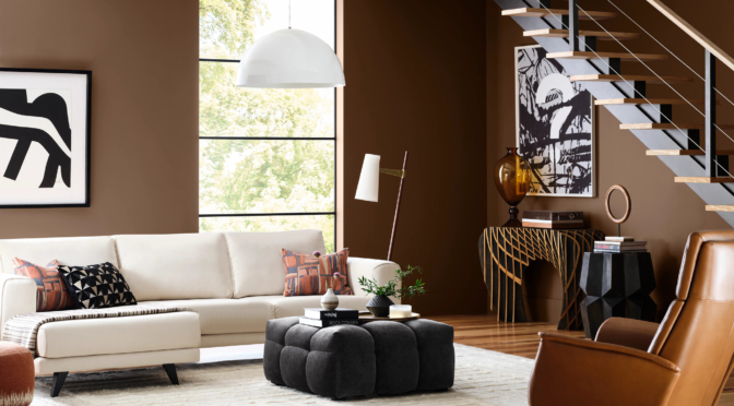
Sherwin-Williams has announced its 2021 Color of the Year: Urbane Bronze SW 7048 (245-C7). A warm, sophisticated bronze, the color inspires all of us to find sanctuary in any space. Urbane Bronze is a rich anchor that grounds the mind in calm and stability with its ties to the natural world. Continue reading Simple and Serene: Find Sanctuary with Sherwin-Williams 2021 Color of the Year
The 2021 Colormix® Forecast: Rhythm of Color
What are the latest trends in paint color? Think rhythm, say the color experts at Sherwin-Williams. Continue reading The 2021 Colormix® Forecast: Rhythm of Color
The 2020 Color of the Year: A Rich Navy Hue with a Hint of Opulence
Sherwin-Williams has announced its 2020 Color of the Year: Naval SW 6244 (253-C6), a rich navy hue taking cues from the Roaring 1920s. Continue reading The 2020 Color of the Year: A Rich Navy Hue with a Hint of Opulence
The 2020 Colormix Forecast: A Perfect Balance
Forty-five trending colors that bring joy, serenity and focus to the mind, body and spirit. That is the theme of the 2020 Sherwin-Williams Colormix® forecast. Continue reading The 2020 Colormix Forecast: A Perfect Balance
Bring the Warmth Inside with Cavern Clay, the 2019 Color of the Year
Channeling the desert modern style, Cavern Clay SW 7701 (290-C6) is Sherwin-Williams® 2019 Color of the Year. In this story, we’ll pass on tips on where to use it and which colors work well with it. Continue reading Bring the Warmth Inside with Cavern Clay, the 2019 Color of the Year
The Future of Color: The 2019 Colormix® Color Forecast
The Sherwin-Williams Color Forecast Team travels the globe to track color’s shifting currents to help you and your customers select the right color for any project.
Continue reading The Future of Color: The 2019 Colormix® Color Forecast
New Portable Tool Eliminates the Color Matching Guesswork
Looking for a lightweight and portable tool for on-the-go color matching? The new ColorSnap® Match handheld color-matching tool is designed to facilitate quick and confident color-matching for you and your customers. Continue reading New Portable Tool Eliminates the Color Matching Guesswork
Color of the Year: How to Make it Work in Commercial and Residential Projects
Oceanside SW 6496 (172-C7), the 2018 Sherwin-Williams Color of the Year is a tremendously flexible color, and harmonizes with other diverse color groups. Continue reading Color of the Year: How to Make it Work in Commercial and Residential Projects
Colormix 2018: The Hottest Trends in Paint Colors
From vivid blue and digital green, to high-def yellow and rusty auburn, the Sherwin-Williams 2018 Colormix Color Forecast exhibits three unique color palettes that draw from emerging global trends. Continue reading Colormix 2018: The Hottest Trends in Paint Colors
6 Secrets to Exterior Color Confidence
Are you the kind of contractor that gets excited about helping their customers choose color? If not, you can be. Make use of these six exterior color tips and you’ll find yourself talking more confidently about color in no time. Continue reading 6 Secrets to Exterior Color Confidence
From Noir to Holistic: The Paint Color Forecast for 2017
By Sue Wadden
With the backdrop of an ever-changing societal and cultural landscape, the four color palettes that make up the 2017 colormix forecast share a vision of renewed spirituality, body and soul nourishment and a determination to define a sense of self. Continue reading From Noir to Holistic: The Paint Color Forecast for 2017
Color of the Year: The Perfect Multi-Purpose Neutral
A hue symbolic of new beginnings, Alabaster (SW 7008) provides an oasis of calmness, spirituality and ‘less is more’ visual relief, says Sue Wadden, Sherwin-Williams Director of Color Marketing. “Alabaster is neither stark nor overly warm, but rather an understated and alluring hue of white.” Continue reading Color of the Year: The Perfect Multi-Purpose Neutral