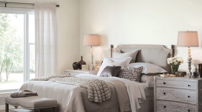
A hue symbolic of new beginnings, Alabaster (SW 7008) provides an oasis of calmness, spirituality and ‘less is more’ visual relief, says Sue Wadden, Sherwin-Williams Director of Color Marketing. “Alabaster is neither stark nor overly warm, but rather an understated and alluring hue of white.”
At a time when people are faced with excess and clutter, the 2016 Sherwin-Williams Color of the Year helps create a relaxed and rejuvenating atmosphere suited for both residential and commercial settings.
From the Pure Vida palette
Drawn from Pura Vida, one of the four palettes in the Sherwin-Williams colormix 2016 forecast, Alabaster represents the prominent use of light, a key element in traditional Nordic design. It also pairs nicely with other popular Scandinavian décor influences including sleek lines, copper metallic finishes, marble and wood grain materials.
Alabaster’s naturally flattering, barely-there undertones make for an attractive option when selecting a neutral color for spaces where people interact, such as lobbies, restaurants or retail settings. In healthcare spaces or a hotel spa, the color promotes a setting for healing and relaxation.
Works well alone or with others
The hue stands alone as a monochromatic statement, or forms a yin and yang harmony with contrasting dark colors, such as Urbane Bronze (SW 7048) or Gray Area (SW 7052).
Comfortable and eclectic, elegant and functional, opposed by shadowy tones or paired with other light blushes and grays – Alabaster is the true neutral to set the tone for 2016.
Want to help your customers pick the perfect paint colors? Visit swcolorsnap.com for all the latest color tools and resources.
This article was originally published in the Spring 2016 issue of PPC magazine. Explore paint colors by family.

