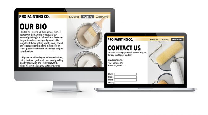
In today’s business environment, whether you serve homeowners or commercial accounts, it takes more than a good reputation to gain profitable painting projects. Among the pages on your website, three hold golden opportunities for you to connect with prospective customers, says sales and marketing specialist Al Pirozzoli: your about us page, bio page and contact us page.
“These also happen to be the most commonly overlooked pages in terms of message,” he says. “Since any one of these three pages will be your first introduction to visitors, the quality of your content is absolutely critical.”
What should your About page be about?
“First off, the About page isn’t really about you,” Pirozzoli says. “I know that sounds strange, but hear me out. Your About page is actually about the visitor who clicks the link to see it.”
Your job, he adds, is to write information that:
- Talks to the visitor about why they should invest time reading your information.
- Addresses the problems you can solve, and in what ways you can help support their needs.
- Gears your words to address their interests.
- Defines what it is that makes your business different in a unique way and how that benefits them.
- Helps “humanize” your business. It’s a personal message, not a business message.
- Forgets about lists of services here (do that on your Services page).
Tell your unique story on your Bio page
“Every business has a story to tell,” Pirozzoli says. “There is someone who started it all and struggled to make the business a reality. People love to hear how those challenges were met and overcome. They’re drawn to the passion that built your business. They’re drawn to stories.”
Amazing but true: the human mind relaxes when a story is told.
“Multiple studies have shown that stories encourage people to keep reading because it resonates with them,” he says. “That’s when a person is most receptive, so don’t lose them now. Break out your storytelling side and create descriptive intellectual and emotional content that engages readers to believe in you, take action and work with you.”
Supercharge your Contact Us page
“Somehow, groupthink has commandeered the web world,” Pirozzoli says. “They think that About Us, Bio and Contact Us pages should sound formal. In fact, most businesspeople find it easier to trust real human beings talking straightforward rather than words that sound like they came from a computer- generated software program. This applies to the Contact page.
“For any number of reasons, there are many people who enter your site by looking at your Contact page. That makes it a great place to include a condensed version of what you offer to support what they need. Make it more than just a contact form to fill out with your list of contact information.”
Bottom line: stand out!
“What makes you different is what makes you money,” says Pirozzoli. “Think of it this way: If you have a product or service that should stand out, don’t let it blend in with all the others out there. Be sure to resist the need to use industry lingo anywhere on your website. Use simple but polished language to convey your company’s offerings so anyone can quickly understand it.”
Al Pirozzoli is a sales and marketing specialist and author of the ebook Forgotten Marketing Success Keys Hidden in Plain Sight. Request a free copy from topflooroffice@aol.com. Get more of Al’s marketing ideas for your painting business in the PPC Digital Edition Archive.

