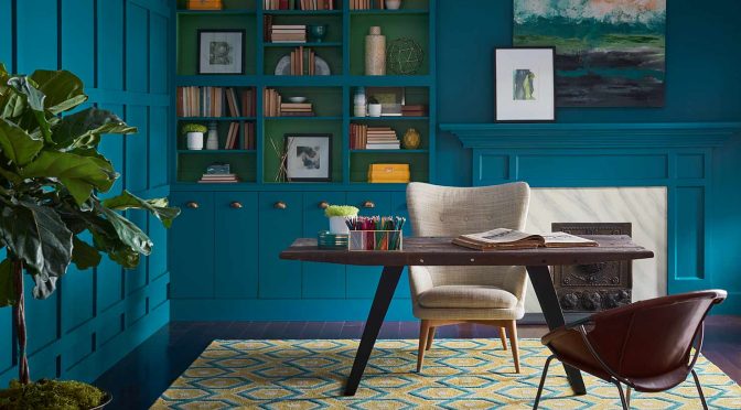
Oceanside SW 6496 (172-C7), the 2018 Sherwin-Williams Color of the Year is a tremendously flexible color, and harmonizes with other diverse color groups.
By Sue Wadden
In commercial spaces
As with other colors found in nature, Oceanside can channel healing and tranquil emotions, but also spur heightened levels of creativity – making for a peaceful first impression in an office or hotel lobby and a bright, imaginative environment in classrooms.
Reminiscent of the deep sea and the multi-tonal nature of the sky, Oceanside offers a memorable, yet calming effect for public spaces. It’s a new twist on navy, a common color for use in commercial spaces. When placed correctly, Oceanside is refreshing and offers dimension and depth as a statement color.
Oceanside pairs best in commercial settings with camel-colored neutrals such as Tatami Tan SW 6116 (291-C5) and Tamarind SW 7538 (289-C5).
As a base color, it effortlessly accents pops of red, like Hearttrhob SW 6866 (101-C5) or Borscht SW 7578 (276-C2).
In residential spaces
Oceanside’s multi-dimensional, marine-inspired look could create a welcoming statement as a lively color for a front door. This green-meets-blue tone can also boost creative thinking and clarity of thought in a home office, or invite meditation and introspection in bedrooms or reading nooks.
It is a bright counterpart to equally eye-catching colors, such as Exuberant Pink SW 6040 (101-C1) or Honey Bees SW 9018 (134-C4). Or it can rest relaxingly alongside other blues like Adrift SW 7608 (280-C2) or In the Navy SW 9178 (253-C3).
It’s also the ideal companion for corals and copper metallic tones. Because of its timeless association with nature, Oceanside is universally embraced by design styles from mid-century modern to Mediterranean-inspired, and traditional to ultra-contemporary.
Part of the Colormix forecast
Oceanside is part of the Unity palette in Sherwin-Williams 2018 Colormix Forecast. Learn more in our story Colormix 2018: The Hottest Trends in Paint Colors.
This article was originally published in the Spring 2018 issue of PPC magazine and was written by Sue Wadden, Director of Color Marketing, Sherwin-Williams. You can find more color ideas, tools and resources at the Sherwin-Williams contractor website.

