
“When it comes to regional color schemes, colors are driven by three factors: architecture, nature and the people who enrich the culture,” says Lauren Makk, a designer on The Learning Channel’s Trading Spaces.
Here’s a look at these factors and how they inspire the use of color across the nation.
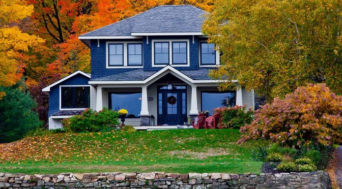
New England
“In New England, you see a lot of deeper hues, like dark grays and greens, reds and navies,” Makk says. “These colors are more historical and all very beautiful. They develop a story about America’s history and what we’re familiar with.”
Such colors are in line with the region’s Colonial, Georgian and Federal-style buildings. In addition to the historical influences, New Englanders often rely on the gray tint of the Atlantic Ocean, the lush greenery in the summertime, and colorful wildflowers (which include deep purples, icy blues and cheery yellows) as both dominant and complementary colors in their homes.
The Mid-Atlantic and Southeastern Coast
With its mix of Tudor, Arts and Crafts, and Colonial architecture, the Mid-Atlantic offers a color palette similar to New England, but with more energy.
“The colors there are very lively and a little sweeter,” Makk says. One such spirited color is sage – likely a nod to the hue of the Atlantic in this part of the United States. The varied tones of the area’s river rock also make subtle appearances in homes here.
Further south in Florida, the predominant Mediterranean- and Spanish-style houses sport red clay-toned roofs and cream-colored stucco on the exterior. But in the interiors, homeowners are reaching beyond the corals and pastels so often associated with the state. Instead, look for the bright blues of the ocean, tropical greens and sunny yellows.
Jewel tones are also making their way into more Florida residences. One theory for the shift to a brighter palette: Retirees and boomers with second homes in the state are more willing to experiment with color than they were in previous homes. Plus, they want spaces that vary radically in look from the homes they have lived in for 30-plus years.
In southeastern Florida, Makk notes that the popular Art Deco style still uses whites and grays with touches of peach.
The South
Like New England, the South is rich in history. The region’s past, along with its charming architecture and colorful culture, influences homeowners’ color choices.
“In the South, you have the antebellum style,” Makk says of the region’s pre-Civil War grand plantations. “A lot of the homes here are brick, too. You have a lot of rich blues and gray blues, oxbloods, yellow ochres, and light greens.”
The Midwest
In a region with severe winters that keep people housebound for many months, Midwesterners seek colors that reflect warmth and invitation. Beiges, taupes and creams have been popular traditional choices, but those colors are evolving into richer, deeper hues.
Earth tones – including wheat, gold-tinged browns and soft greens – complement the Midwest’s diverse architectural styles, such as Prairie School, Farmhouse, and Arts and Crafts bungalows.
The region’s Scandinavian roots also play a role in many of the current loft-style spaces in major metropolitan areas by using bright, bold primary colors.
The Western Mountains
The Western mountains of Colorado, Wyoming, Utah and Montana conjure images of the rugged cowboy/rancher surrounded by tall, rocky hills and the dust of the earth. Popular colors for this area reflect that legend and landscape.
“The people are inspired by their landscape and history,” Makk says. “They use yellows, ochres, rich sienna browns, denims, rust, golds and bright greens.”
The Southwest
Being so immersed in Hispanic and Native American culture, the Southwest is very drawn to the traditional color schemes and certain palettes of these civilizations, Makk says.
Consequently, the beiges, red-oranges and terra cottas affiliated with the adobe style continue to infuse the homes of the Southwest. Haciendas or Santa Fe-style homes, along with Old World-influenced architecture, borrow a similar color palette. Homeowners in New Mexico, Arizona and the deserts of California are enhancing their homes by incorporating chocolate browns, blazing reds, yellows and coppers.
Southern California, meanwhile, has established its own eclectic blend of color.
“Our environment is very bright and tropical,” says Makk, who lives in Los Angeles. Among the diverse cultures reflected in Southern California’s architecture, the Spanish influence is dominant.
“That’s a lively culture evident in the houses here,” she says. Tangerines, marigolds, pinks and lime greens are bold yet common color selections.
The Pacific Northwest
Monochromatic. That’s how Makk describes the typical color palette for the Pacific Northwest. Look for “lots of grays, deep blues and whites – sort of a fisherman’s color scheme,” she says.
Still, many people in this region jettison what they see as pallid tones in favor of tans, golds and reds. Such use of color helps counter the rainy season. Conversely, inspired by the verdant forests of this region, you’ll see various shades of green too.
The northwest coast’s architecture, a happy blend of Asian and organic themes, often features light-toned woods and large windows – design elements that are complementary to both bold and subtle colors.
The original version of this article was published in Stir magazine. You can find more paint color tips and tools at the Sherwin-Williams contractor website.