By Sue Wadden
With the backdrop of an ever-changing societal and cultural landscape, the four color palettes that make up the 2017 colormix forecast share a vision of renewed spirituality, body and soul nourishment and a determination to define a sense of self.
Our forecast this year is an exploration of the trends and influences that are emerging to drive design towards a state of restless energy. Each of our four palettes tell a distinct color story, offering opportunities for homeowners and professionals alike to explore color in new and exciting ways.
Based on extensive research and insights into global trends, we’ve developed four palettes – named Noir, Holistic, Intrepid and Unbounded – consisting of 10 colors each.
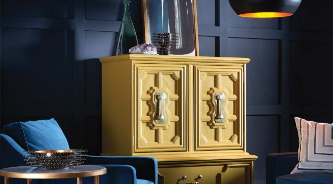
Noir
We’re craving a refuge from urban streetlights and glowing screens, searching for spaces to turn our gaze inward and recharge the spirit. Driven by a renewed interest in faith and spirit and celebration of the night, the Noir palette is rich with colors that evoke vine-ripe fruits, Nordic blues, moody neutrals and golden yellow – a new romanticism marked by medieval patterns, revived customs and bittersweet beauty. The Dutch painting masters knew the secret – dark hues set a dramatic stage for sensuous luster. This stark style looks completely modern in residences or commercial properties.
Holistic
Sustainable design and transparency are the new standards. Doing good is the new looking good, and it’s taking the form of healing retreats and eco-travel. The colors of this holistic palette include arctic neutrals, blush rose, wild browns and forest floor green. The Holistic palette is softly balanced and beautiful, and perfect for restive spaces. This is a grown-up version of pastels. Soothing, warm tones pair with airy cools for a harmonious and nature-inspired palette.
Intrepid
The virtual and the real are blurring in the form of a seamless commerce. Impatient for social and political change, individuals are continually reinventing themselves. Youth culture and global collaboration lead to a feisty energy, which influenced this retro palette, including fiery oranges, vibrant kimono colors and the simplicity of black, white and gray. The Intrepid palette has amazing versatility, which allows for a modern, bright light or a 1970s vibe of smoked glass, bright brass and geometric patterns. It’s also the perfect palette for hospitality settings, blending tech innovation with bold design and color to create a wholly contemporary aesthetic.
Unbounded
Global immigration is redefining national identities. Brands are becoming more purpose-driven, and communities more connected. Design is adapting to more diverse populations. Global consciousness is captured in this palette’s earthy mustards and browns as well as ocean blues and corals. The earthy and spicy nature of the Unbounded palette tells the story of how migration is forcing cultures to mingle and share a collective “we.” Audacious colors in combination with a confluence of foreign patterns and exotic textures can create a look that is striking and entirely new.
This article was originally published in the Winter 2016 issue of PPC magazine. Sue Wadden is the director of color marketing for Sherwin-Williams. You can find more color ideas, tools and resources at the Sherwin-Williams contractor website.