As a professional painting contractor, you know that color selection can be one of your customers’ biggest pain points. With so many color options available, it’s easy to see why. So how do you help your customers make informed choices and get your jobs started quickly?
The good news is that you and your customers don’t have to be color experts. You can rely on the experienced color professionals at Sherwin-Williams, who have developed easy-to-use tools and resources to help make the color decision process faster and easier.
Something new for 2024
Anthology: Volume One is a new approach to the annual Sherwin-Williams Colormix® Forecast for 2024. This color trend report explores the latest directional shifts in the landscape through a collection of 48 hues organized by color family.
By grouping the palettes together by color families, this year’s Colormix Forecast will make it easier than ever for homeowners and other clients to select trending colors, says Krista Beyer, Sherwin-Williams Designer Marketing Manager.
Discover the meaning behind these chosen colors, their role in awakening modern aesthetics, and what the future holds for blues and greens, reds and purples, dark tones, and delicate tints.
Palette No. 1: The convergence of blues and greens
This palette revolves around a central color connection, blending and dispersing across a broad range of organic, calming-yet-invigorating gray-blues, bluish-greens, and everything in between. From barely there to bold and bright, the decade’s two defining color families remain customer favorites.
Palette No. 2: The poetry of reds and purples
Ravishing reds and purples put on a dynamic display in this collection, with warm crimson, soft blush and beige, sweet purples, and nostalgic pops of cheerful color. Balanced by the growing popularity of natural clay and baked pigments, this palette will lend a muted but expressive touch to your customers’ spaces.
Palette No. 3: A gathering of deeps and darks
Deep, dark colors are becoming a favorite way to create an atmosphere of restful retreat. This important color group can introduce powerful and dramatic contrasts into your customers’ spaces.
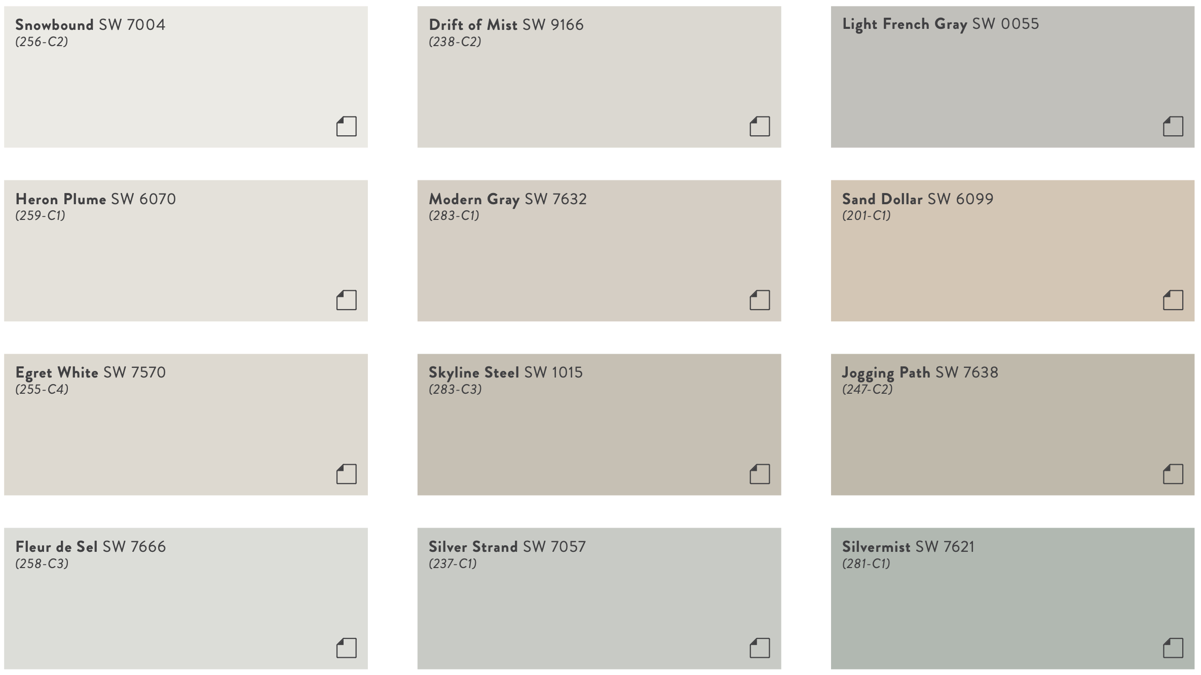
Palette No. 4: A study in delicate tints
This hushed and harmonious palette mixes airy tints and soft whites with warm and cool undertones that will lend serene sophistication to your customers’ spaces with the gentlest hint of color.
Color Trend Report for Commercial Spaces
Do you have commercial customers that are struggling with color selection? To help you meet that need, Sherwin-Williams has developed the 2024 Color Trend Report for Commercial Spaces, an exclusive resource applying the trend-forward collection of Anthology: Volume One to the commercial landscape. As the Sherwin-Williams team of color experts craft the Colormix Forecast, they hand-select key commercial colors, weaving them into each palette.
From stunning blues and greens to dramatic darks and deeps, these curated hues will help your customers pick the perfect colors for their commercial, hospitality, education, healthcare, multi-family and new residential spaces.
View the Color Trend Report for Commercial Spaces Lookbook
More color solutions
The Colormix Forecast is just one of many excellent, easy-to-use color resources available to paint pros. The Color Toolkit, available in the Sherwin-Williams PRO+ App, will help your customers pick colors confidently. Share links that let them explore colors, order samples and more.
You can also become an invaluable resource to your customers with free Sherwin-Williams Virtual Color Consultations. Use this service to connect them with a trusted and trained color expert or request a free online session with a color expert. With this exclusive service, you and a homeowner can proceed with confidence that color selections will result in maximum customer satisfaction.
The ColorSnap® Match Pro is another tool that eliminates the guesswork in paint matching for you and your customers. Simply use the ColorSnap Match Pro device (available at your local Sherwin-Williams store) to scan the color of a flat surface and instantly match the color to the closest paint colors and sheens in the ColorSnap Match app for iOS and Android devices.
Learn more in our ColorSnap Match Pro FAQs.


