What are the latest trends in paint color? Think rhythm, say the color experts at Sherwin-Williams.
“We started telling a story last year about using color to help us feel grounded as we were headed into a new decade,” says Sue Wadden, director of color marketing at Sherwin-Williams.
“Now we are continuing that inward journey by exploring the past, examining the present and looking at what this all means for our future. The rhythm of color is examining where we’ve been to help inform where we’re going and to help us create that central hub that is so vital to our everyday living and working now.”
Wadden and the Global Forecast Team of color professionals at Sherwin- Williams spent time researching color, design and pop culture trends across the globe. They held a workshop to discuss and debate their research, leading to the final forecast of bright and bold blues, muddy greens, muted reds, bright pinks and warm whites.
The result is the 2021 Colormix® Forecast, a collection of 40 hues across four palettes that celebrate the rhythm of color – the balance between fast and slow, quiet and expressive, and virtual and physical.
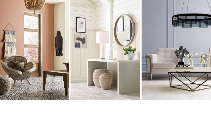
Sanctuary: Back to Nature
The Sanctuary collection focuses on the connection that the natural world has to nurturing wellness and calm. The quietness of Pure White SW 7005 (255-C1) is a signal to take respite, slow down and embrace what’s truly important. The warm minimalism of Morris Room Grey SW 0037 is a reminder that less is more.
See the full collection of Sanctuary colors
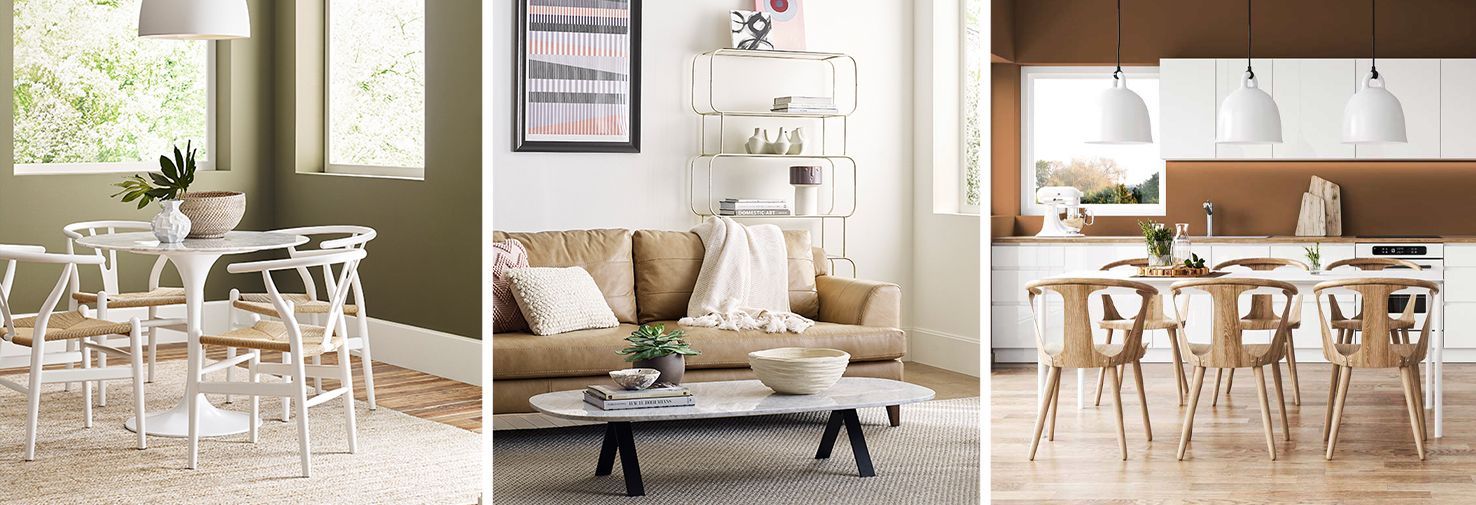
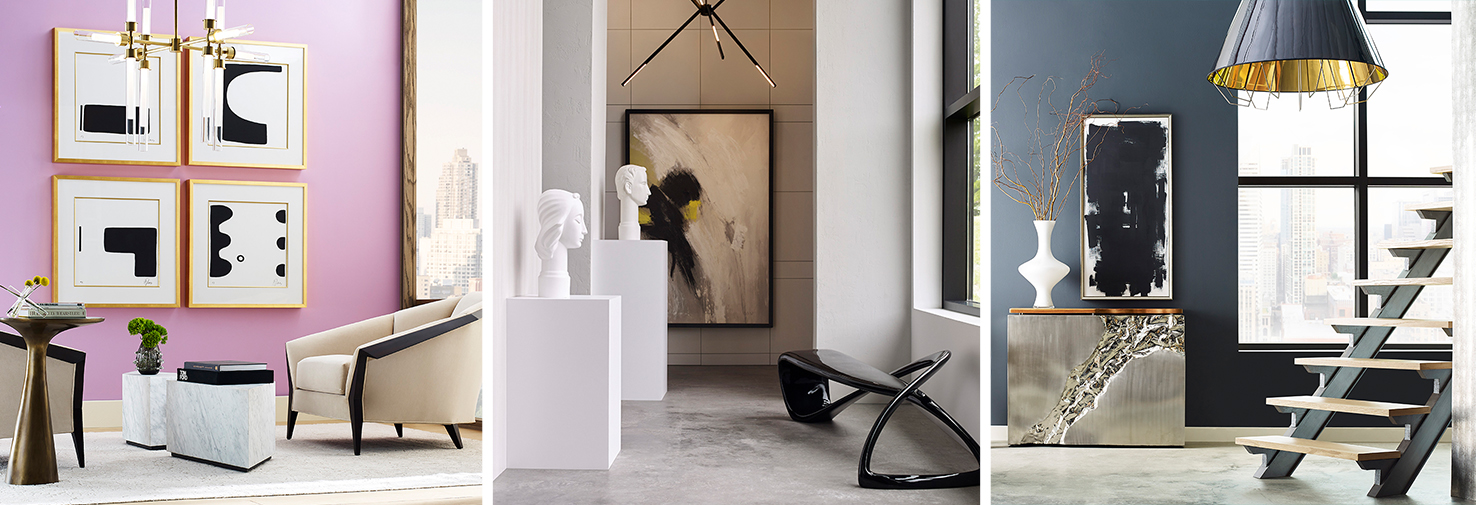
Encounters: Layers of Local Character
The Encounter palette has a modern bohemian aesthetic and natural materials complement the earthy tones, like Rosemary SW 6187 (215-C6) and Reddened Earth SW 6053 (194-C5). These colors take visual cues from the past’s humble beginnings, speak to the present and guide the path forward.
See the full collection of Encounters colors
Continuum: An Ethereal Spectrum
The Continuum palette tells the story of smart living and how technology ties into how people live and the desire for it to blend seamlessly into the whites, charcoals and pops of color in everyday environments. It features bright, forward-thinking colors such as Novel Lilac SW 6836 (183-C3) and inky hues such as Commodore SW 6524 (185-C7).
See the full collection of Continuum colors
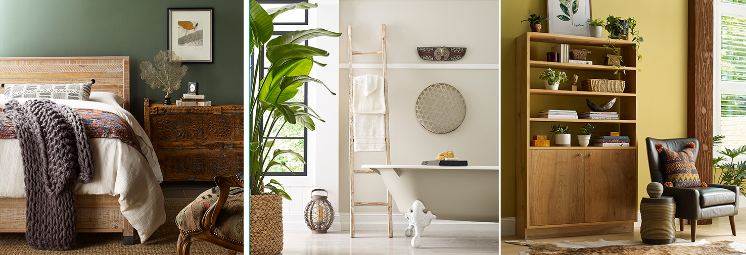
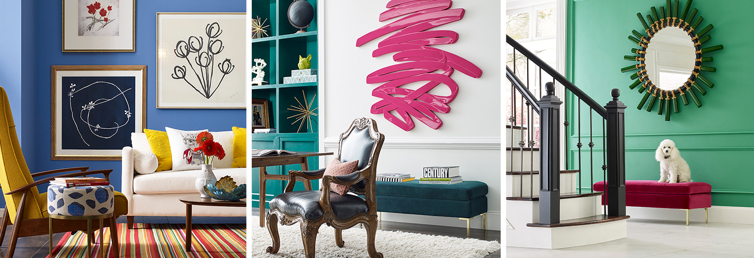
Tapestry: Permission to Play
Creative expression is a top influence on the Tapestry palette. The happy and modern hues are meant to signal joy and layer together to tell a story through texture and pattern. Additional influences, such as security, reinvented classics and sensory exploration, can be found in standout, vibrant colors like Jaipur Pink SW 6577 (104-C3), Alexandrite SW 0060 and Perfect Periwinkle SW 9065 (179-C5).
See the full collection of Tapestry colors
A condensed version of this article was originally published in the Fall 2020 issue of PPC magazine. Get more color tips and tools at the Sherwin-Williams contractor website.