Commercial spaces were one of the key considerations when the color experts at Sherwin-Williams gathered to compile their 2025 Colormix® Forecast. In this article, we’ll take a look at some examples of the colors of each of the four new Colormix palettes in office spaces, hospitality, healthcare, education and other commercial properties.
Chrysalis
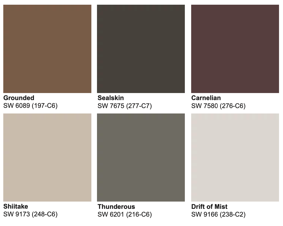
“Chrysalis offers minimalist, raw neutrals perfect for creating serene, uncluttered spaces that evoke a sense of calm and simplicity,” says Sue Wadden, Sherwin-Williams Director of Color Marketing.

Thunderous SW 6201 (216-C6) from the Chrysalis palette
Kindred
“Kindred embraces warm, community-focused colors that foster connection and create inviting, cozy environments perfect for gathering,” Wadden says.
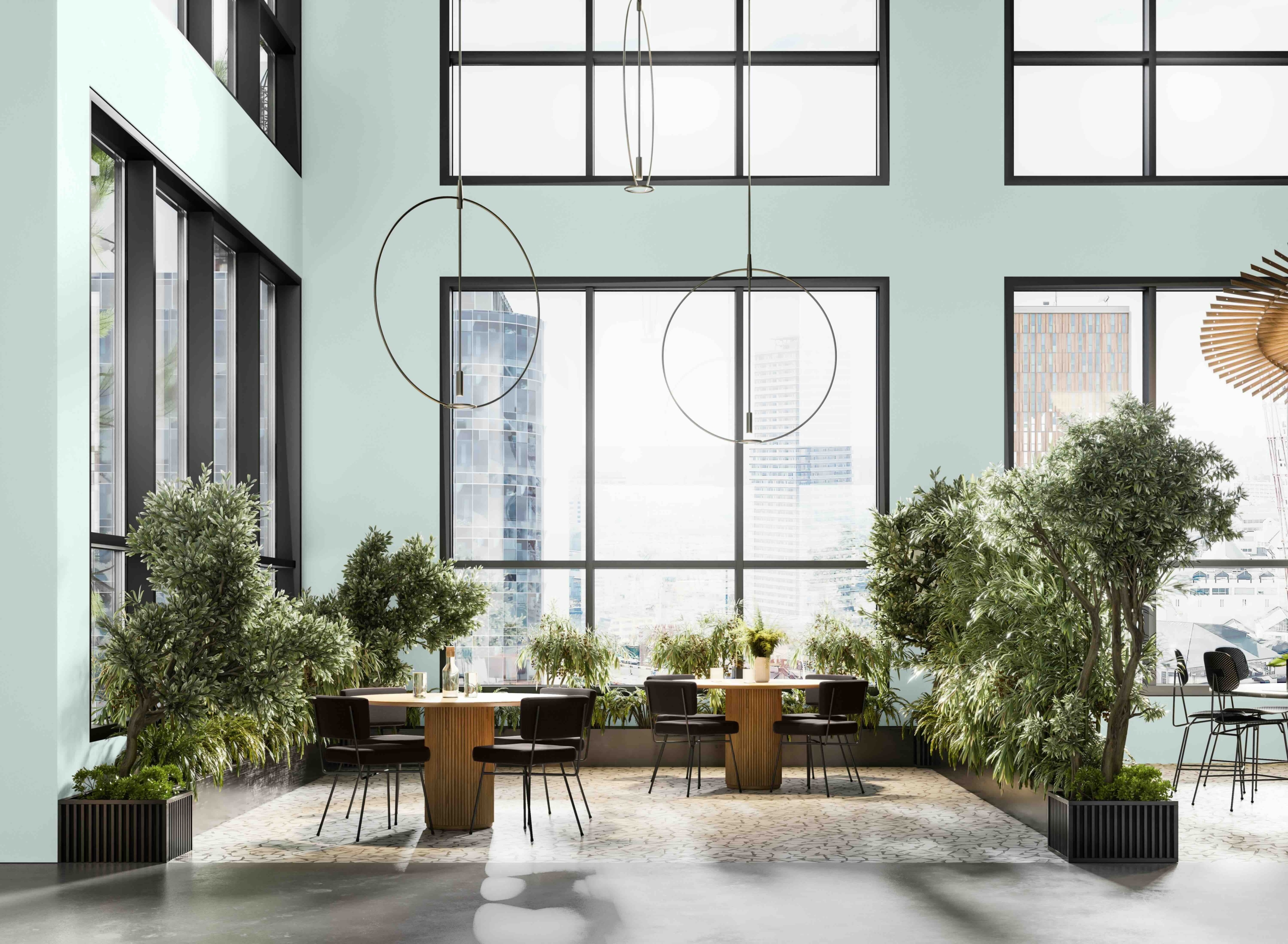
Tidewater SW 6477 (170-C1) from the Kindred palette

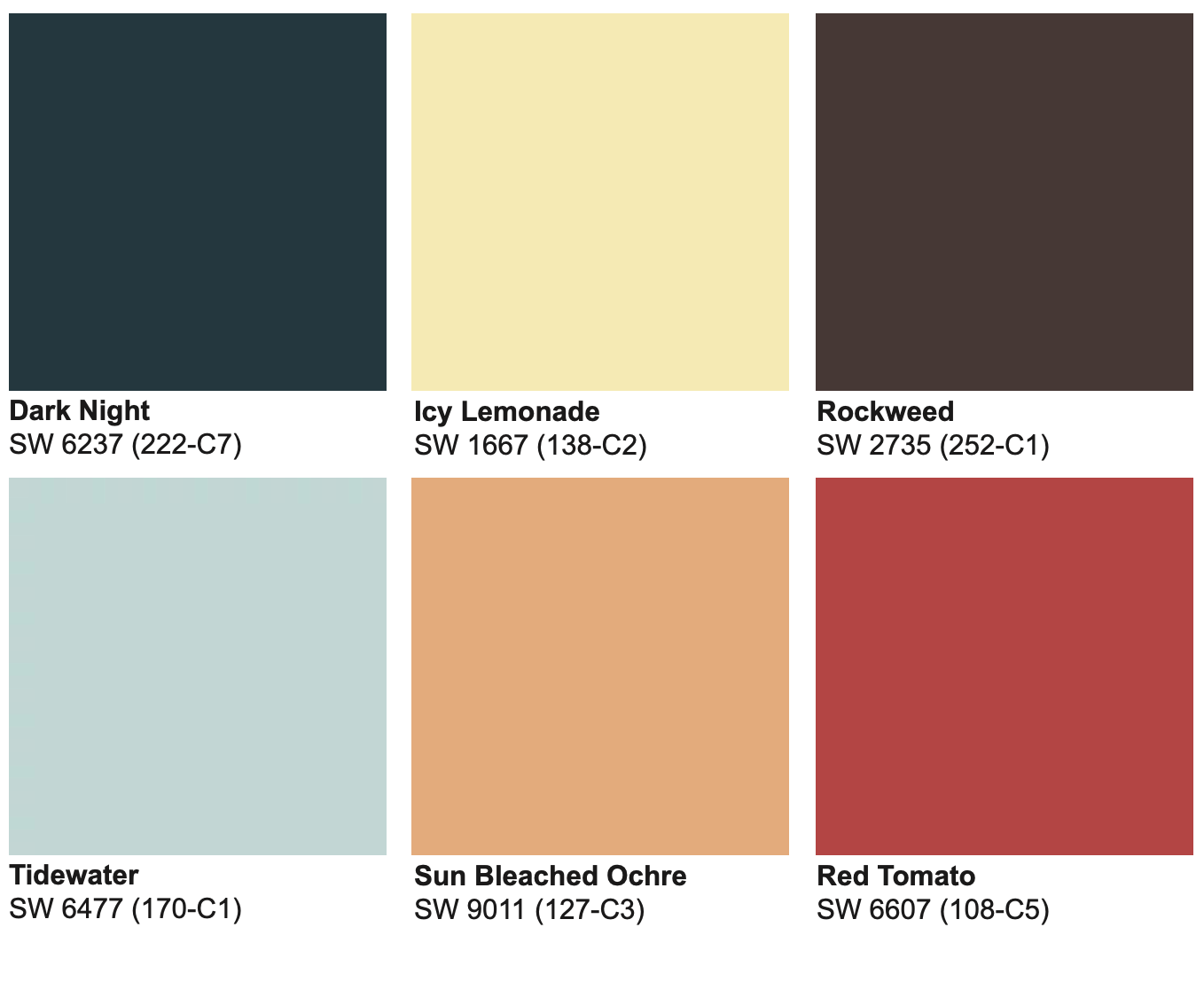
Tidewater SW 6477 (170-C1) and Dark Night SW 6237 (222-C7) from the Kindred palette
Paradox
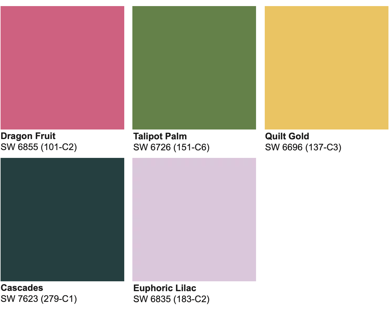
“Paradox features bold, dynamic colors designed to make a statement and energize any space with vibrant, eye-catching hues,” Wadden says.

Talipot Palm SW 6726 (151-C6), Quilt Gold SW 6696 (137-C3) and Euphoric Lilac SW 6835 (183-C2) from the Paradox palette
Wellspring
“Wellspring draws from heritage-inspired tones,” Wadden says, “bringing timeless elegance and a sense of history to modern interiors.”

Oyster White SW 7637 and Outerspace SW 6251 (225-C7) from the Wellspring palette
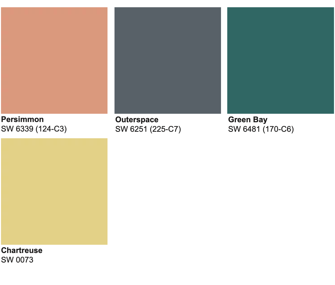
More trending colors
View the entire collection of the 2025 Colormix Forecast colors at swcolorforecast.com.
This article was originally published in the Winter 2024 issue of PPC magazine. ©2024 Fusable. Photography/art courtesy Sherwin-Williams. Color samples show approximate actual paint colors as closely as possible.

