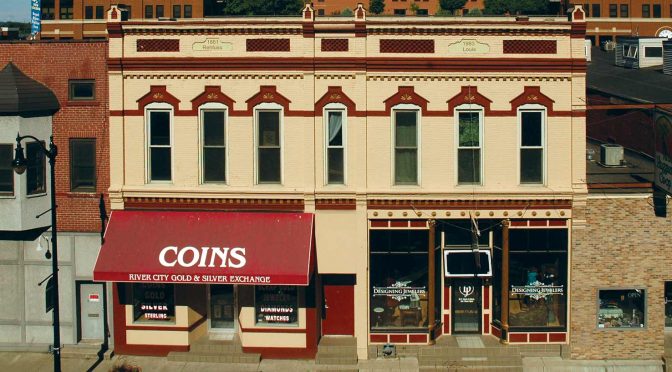
Paint color transformed a historic property and helped Designing Jewelers gain recognition as one of “America’s Coolest Stores” from InStore magazine. Two Sherwin-Williams masonry coatings provide the one-two punch for long-lasting protection on the repaint of the 136-year-old building.
Updating a classic
Business owners like Al and Brenda Louis are part of a downtown renaissance in La Crosse, a city of 52,000 on the Mississippi River in Wisconsin. They recently teamed up with local contractors to renovate the historic Frederick Rehfuss Building. Originally built in 1881, it’s now a multi-purpose property housing two apartments and two retail businesses, Designing Jewelers and the River City Gold and Silver Exchange.
Renewing the substrate and revitalizing the storefront image
The exterior paint was cracking and peeling and generally in bad shape, says Lori Larson, owner of Larson Paint and Stain, the La Crosse commercial and residential painting contractor that won the coating bid. In addition, the dull gray color of the exterior paint wasn’t doing much to attract business.
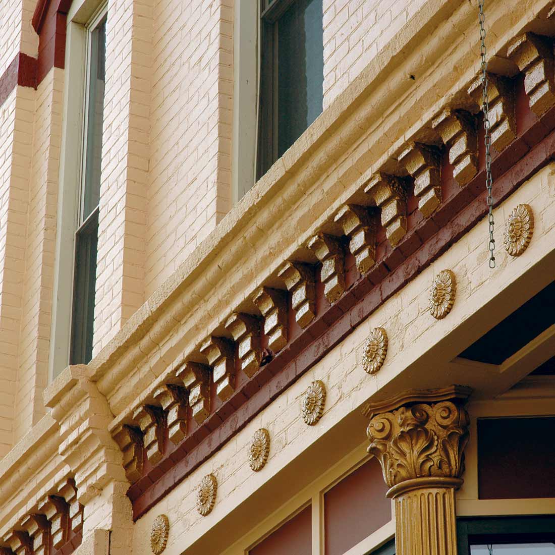
Working off a multi-color scheme developed by the owners and interior designer Lu Cagin, Larson brought the colors for custom matching to her trusted Sherwin-Williams store in nearby Onalaska, Wisconsin.
“The building looks so much better now,” she says. “The new colors really make it pop.”
Long-lasting protection for an extreme climate
Larson has also provided the owners with a tough finish that will last a long time.
“For a brick building like this, we needed a paint that’s capable of expanding and contracting with our extreme hot and cold temperatures,” she says. The solution was a combination of ConFlex XL™ High Build Coating and Loxon® Masonry Coating – products she has had much success with when repainting stucco homes.
After brick tuckpointing and pressure washing, Larson and her crew used a lift to apply the paint on the busy street. ConFlex XL was used on the majority of the surface. Loxon Masonry Coating, which is available in darker color bases, was used for the sections that were painted a dark maroon color.
Interior gets attention too
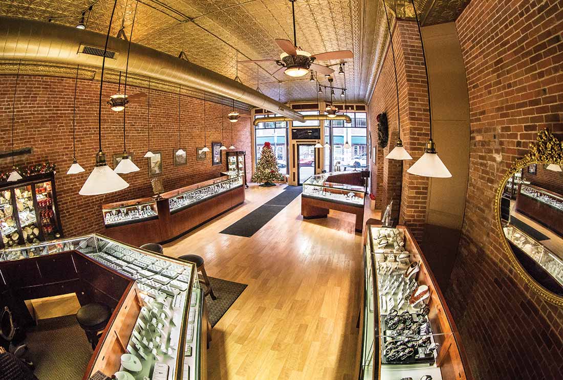
Significant renovation was done on the building interior. Several feet of walls were removed to reveal the original brick, and a number of false ceilings were knocked down to get to the original tin ceiling.
Larson used ProMar® 200 Zero VOC Interior Latex throughout the interior spaces in both retail stores. Along with Cashmere® Interior Acrylic Latex, it is one of her favorite interior paints.
“ProMar 200 has been my go-to for years,” she says. “It’s easy to apply and has a nice finish. I also get excellent hide with this paint.”
This article was originally published in the Winter 2017 issue of PPC magazine. Story and exterior photography by Mike Starling, PPC Editor. Interior photography by Bob Good. Read about other successful painting projects in the PPC digital archive.


