
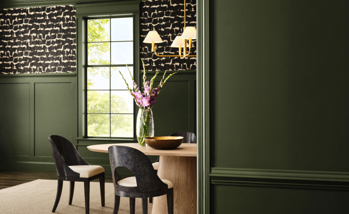
This year’s Sherwin-Williams color forecast is designed to work in countless combinations.
Professional painters rely on Sherwin-Williams to help them simplify the color selection process for their customers. The annual Colormix® Trend Forecast streamlines that step by providing handpicked hues to guide the decision-making process.
“Being asked questions about colors can make some painters uncomfortable, but it doesn’t have to,” says Emily Kantz, Color Marketing Manager at Sherwin-Williams. “Having the Colormix Trend Forecast in your back pocket can give you confidence that you know what you’re talking about when it comes to trending color.”
What is Colormix?
Colormix is an annual color forecast curated by Sherwin-Williams and its Trendsight TeamSM made up of the foremost thought leaders and design professionals in the color field.
With over 200 years of collective experience across industries, continents and specialties, these experts combine research, analytics and diligent trend tracking to monitor and report on the monumental changes that will define the future of color across the globe.
“Our 2027 Colormix Trend Forecast, Rewild, is a versatile collection of the trending hues predicted to shape the design landscape of the future, selected to work together in countless combinations,” Kantz says. “Use it to give your customers the freedom and confidence to experiment as you help them create standout spaces.”
Colors: Taiga SW 9654 and Universal Khaki SW 6150. Tap photo to see all the 2027 Colormix colors.
A different approach this year
What’s new for the 2027 forecast? Instead of determining set palettes, the Sherwin-Williams color team focused on three design stories, each one defined by moments in time: the past, the present and the future. The themes are: Revive, Reignite and Reconnect.
“Color is deeply personal,” Kantz says. “Many people want to know what’s trending, but oftentimes are intimidated or unsure on how to incorporate trending colors into their home. For this year’s forecast, it felt like the right moment not just to highlight trending colors, but to give customers the freedom to explore the variety of options and combinations of color across any style or project. It’s a bit of a choose-your-own-adventure.”
From a color perspective, there was alignment with more color saturation, as well as more nature-based color direction.
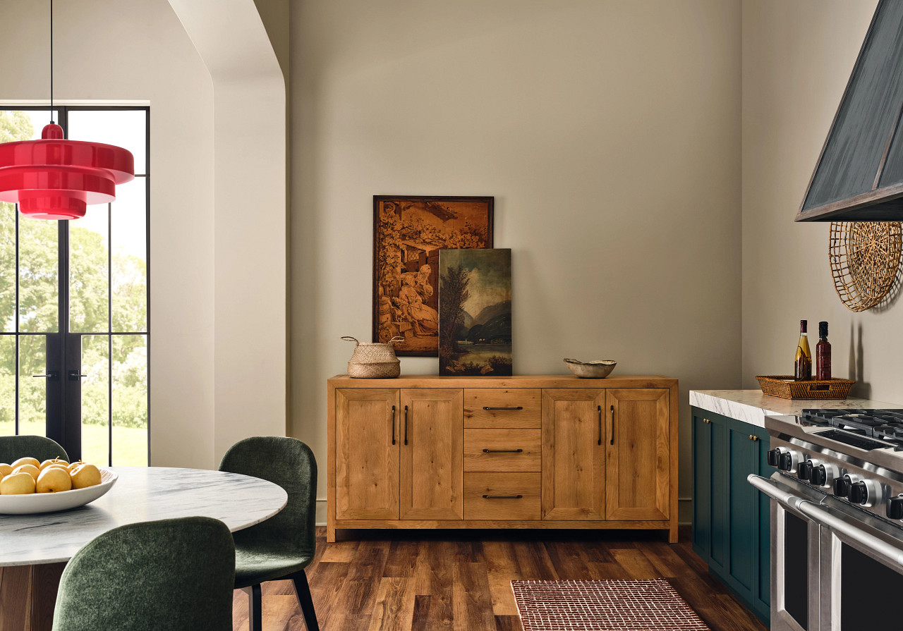
“Think mossy greens, deep browns and charcoals along with complex reds,” Kantz says.
The shift is partly a response to years of minimalism and neutrality.
“People are craving spaces that feel more personal, uplifting and full of energy. It also ties into the pull away from digital sameness,” she says. “When everything online looks polished and identical, people are looking for something different in their physical spaces. What people are ultimately looking for are environments that help them feel their best, whether that means leaning into vintage vibes, adding unexpected pops of color or creating something entirely their own.”
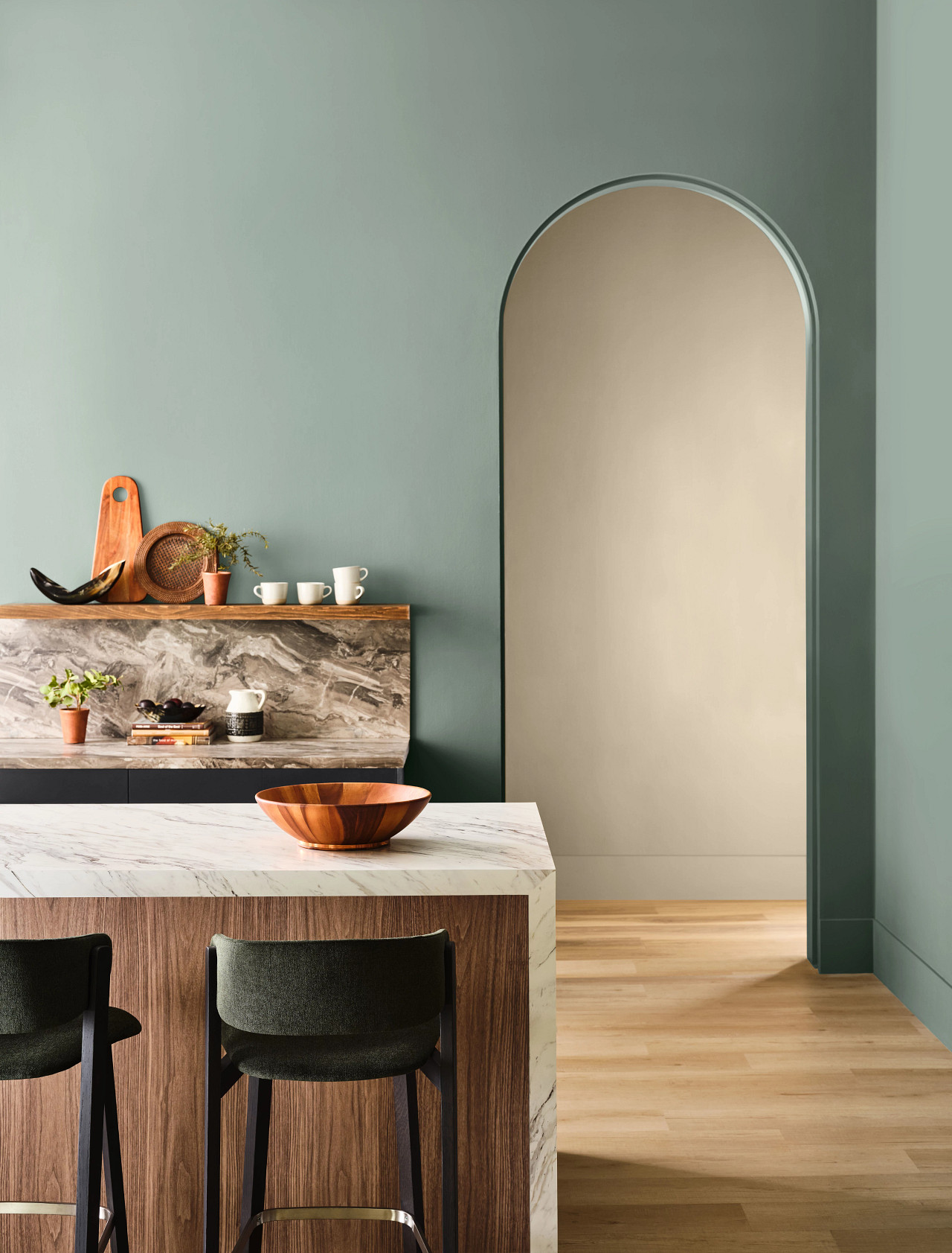
Colors: Beachcomber SW 9617 (walls), Cascade SW 7623 (cabinets). Tap photo to see all the 2027 Colormix colors.
Continuity Colors of Rewild
Within the 2027 forecast, 10 colors have been chosen to represent the hues that are carrying through the trend landscape most strongly from year to year. These versatile colors can be paired with the colors of the forecast to ground and refine any palette or project.
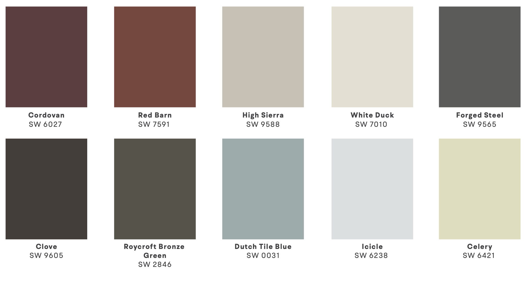
“I think the colors that transcend trends are the ones that have a kind of chameleon quality to them,” Kantz says. “Some carry an innate warmth and depth while others enhance calm and balance, and there’s a complexity that allows them to shift depending on how and where they are used. For me, the most enduring colors are the ones that connect back to nature – those deep mossy greens, lichen tones and mineral shade or rusted, stone-like hues. I think we’re naturally drawn to those colors – they bring a sense of comfort and familiarity, but also enough richness to feel elevated.”
Bottom line, the paint colors that surround us are an important part of our daily experience, now and in the future.
“I think color is going to continue to bring deeper meaning into our spaces,” Kantz says. “It won’t be added just for the sake of it – it will have purpose. It’s about how color makes us feel: how it can energize us, calm us, comfort us. It becomes part of our story, shaping memories, connecting us to moments and helping us create new ones. Color is going to continue to be intentional, more emotional and ultimately, more human.”
Learn more
Discover the 2027 Colormix® Trend Forecast and get free chip samples for the 10 Continuity Colors.
©2026 Fusable. Photography courtesy Sherwin-Williams.